Edit 23 Sept 15.41 GMT: I apologise to those of you who downloaded the buttons earlier...I had saved them at the wrong resolution!! I have updated the file with the correct zip now, so please download the updated file. Sorry!!
Last week I said I was running day behind with my week...well that still holds good!! I just never seem to have made the day up. I'm thinking of rearranging the calendar and subtracting a day, just for me. Only problem is I don't know who to apply to, lol!!
I love buttons and there are so many that you can make, the variations are endless. Then having made them you can add stitches or bows, even more fun!! For today I thought that a basic button would get us started. It will show you how to save a basic button template to use again and again too.
The tutorial is written in Photoshop CS2 but I am sure you can adapt the principle for your own software program.
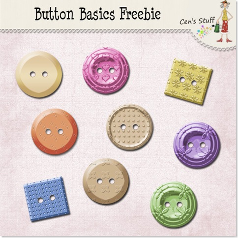
If you prefer to download it as a pdf you can do that with the link at the end of the tut and there's an other link to download some freebie little buttons that I made for you.
So Lets Make Some Basic Buttons!!
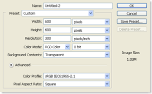
1. Open a file with the following settings, just I have done. 600 x 600 pixels, 300 pixels/inch, RGB Colour, 8 bit, Transparent. (This size makes it large enough for you to work comfortably but you may want to reduce the size of the finished button).
2. Now set your foreground colour to black and background colour to white, the quick way to do this is press D.
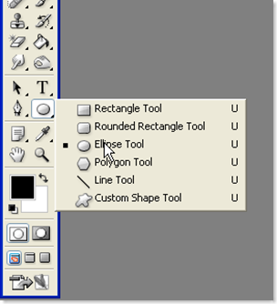
3. Next select the Ellipse Tool from the side tool bar.
Make sure you have the Fill Pixels option selected in the top tool bar. 
4. Now to make our circle! Hold down the shift key and draw out a circle (holding down the shift key as you drag makes sure that the circle stays in proportion). Remember if as you draw you want to move the circle, press the space bar and hold it down, this will give you the little hand symbol which will allow you to reposition your circle…but don’t let go of the mouse whilst your doing it!!
5. Now add a new layer above your circle by clicking on the icon at the bottom of the layers palette or from the top menu bar Layer/New/Layer. This layer will be for our holes…yes, our holes.
6. Making sure that the holes layer (layer 2) is the active layer, change your foreground colour to white. A quick way to do this is press X.
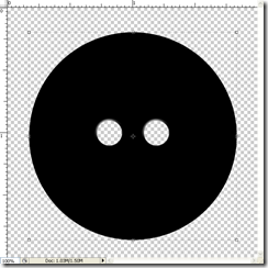
7. Now select the brush tool from the side tool bar and pick a hard round brush the size you want your holes to be. I have used a hard brush at 60 pixel size for mine. Click once with your mouse on the new layer to make one stroke with the brush. 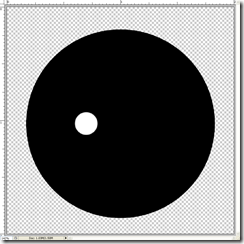
8. Select the Move Tool from the side tool bar and hold down ALT and then click on the hole and drag. This will duplicate the hole layer and now we have two holes on two separate layers. 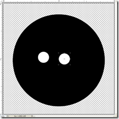
9. We need to line them up with each other as they are looking rather out of line. So hold down the Shift Key and click on each of the hole layers so that they are both active.
Now click on the Align vertical Centres icon in the top tool bar to line them up.
10. Merge these 2 layers by holding down Shift and clicking on both layer to make them active, then press Ctrl and E to merge. We now have both holes on one layer.
11. Now we need to align the button and the holes so make sure that both layers are active by holding the Shift Key down and clicking on each layer. Then click the Distribute Horizontal Centre in the top bar to centre them.
Now our holes and buttons are align properly.
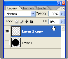
12. Now comes the clever part!! Select the Holes layer and change the fill value to 0.
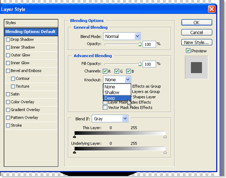
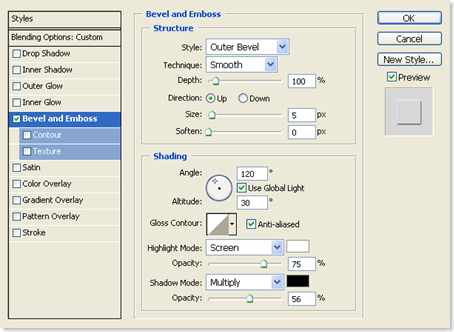
13. Open the Layer Style (double click on a blank area of the layer name).
Under Advanced Blending change the Knockout to “Deep”.
Now we have the basic we can go on to the next step - giving the button some shape and colour!
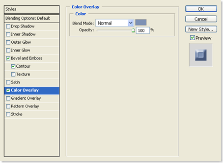
18. With the button layer selected open the layer styles palette and click on colour Overlay. Pick the colour you would like your button to be. I used a blue, 7e92b6. It is easier to change the colour for the button here than changing the template colour.
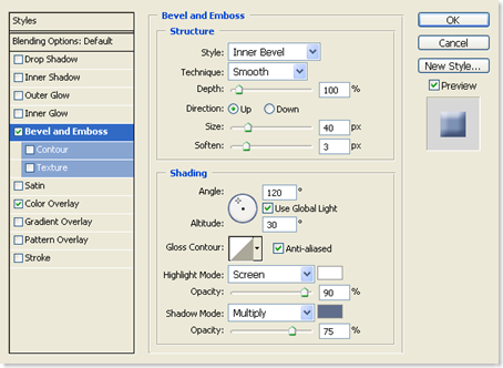
Keeping the layer style palette open click on Bevel and Emboss and use the settings below:
Note that I have changed the Shadow Mode Colour from black to a slightly darker shade of my blue. This makes for a less harsh contrast on the bevel.
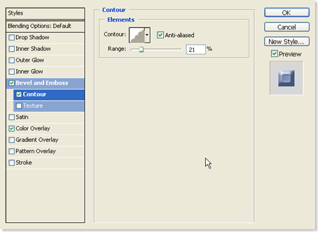
19. Now click Contour. I’ve changed the Contour here to Rounded Steps by clicking on the little arrow at the side of the Contour Picker. I moved the slider and set it at 21%.
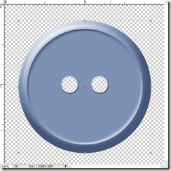
If you want try picking a different contour and then playing with the sliders, This will give you different shaped ridges. When your happy press OK.Here's what my button looks like.
There are so many other things we can do to dress up our button, patterns, texture etc…. but that’s for an other time!!.
You can add Texture and overlaying a texture on it. Play with the scale and depth of these until you get the effect you want.
Also try overlaying a pattern. Click Pattern Overlay and then select a pattern and play with the opacity and scale.
The permutations are endless!! Have fun!!
Download the tutorial in pdf here
Download the freebie buttons here



14 comments:
Button Button and more Buttons. Can never have enought of these. Yours are very clever and have that extra June touch! Thanks for the TUT :)
Oh how wonderful thank you I shall see if I can make it work in GIMP!
Thankyou so much for not just sharing the buttons you have made but also the tutorial. I will have a play around with it today - am pretty sure I can convert it to the program I use. Thanks again.
Well,aren't you the nicest person to take the time to make this tutorial for us. As I new PS user, I thank you BIG TIME!!
WONDERFUL !!!!
June, you are a girl after my own heart and keyboard!!!
Thank you so much for this... I'm learning so much from you!
Stella
Wow... Deja Vu!! This is what I first asked you about way back when :) I was on such a button craze. Thanks sooo much for the Tut and the buttons. If you figure out how to get that day back, let me know please since I'd like to get a couple back myself! TTFN ;)
Thanks so much for the tutorial and the cute buttons! :)
Thank you June and I wonder if? If one day I can make a button, thanks for the tutorial, I will try.
Brilliant June... excellent tutorial as usual... we all need a little help sometimes and your tuts are just so easy to follow. Thanks for sharing... I love tuts like these... you're a star.
hugs
Chris xx
Cen! Thanks for the TOOLS. Remember the old proverb "give a hungry man a fish and you feed him for a day - teach him to fish and he can feed himself" - thanks for teaching us to fish! =)
wonderfull button,
nice step by step tutorial
thanks for sharing.
Very nice step by step tutorials.
Such a well written and illustrated tut. THANK YOU.
Been playing with Photo Shop for about a year and several things hadn't stumbled on (align, 0 fill...)
Cecile, Milwaukee, Wisconsin
thank you SO MUCH for taking the time to do this tutorial!! it looks awesome and i can't wait to try it!
Post a Comment